SBW Logo
The logo revision process is complete and the results can be seen here. For this revision process, Net Solutions and I focused on how well the logos would integrate with our current report design while providing variations of the original concept. LogoWorks had a very different process than Net Solutions, but the results of this process are based on the initial choice made by Hrag.
The correct background color is seen in the Variations presented by Net Solutions. Interestingly enough the RGB values were the same for the background of each image prior to when they were uploaded. However, the right idea is conveyed and what looks good in one would look good in the other.
Initial Design
Logo 00 This was the original logo created by Net Solutions.
Logo 0 This was the initial redesign of the original logo.
Integration
The following images show how these initial two designs would fit into the current reporting design.
Removing the black border provides a more aesthetically appealing logo, at least when integrated with our current design, or any design that has a background color.
Logo 1 is just the inverse of the Logo 0 that was shown above, they could be used interchangeably depending on if a background color was present or not.
Logo Choice
Net Solutions
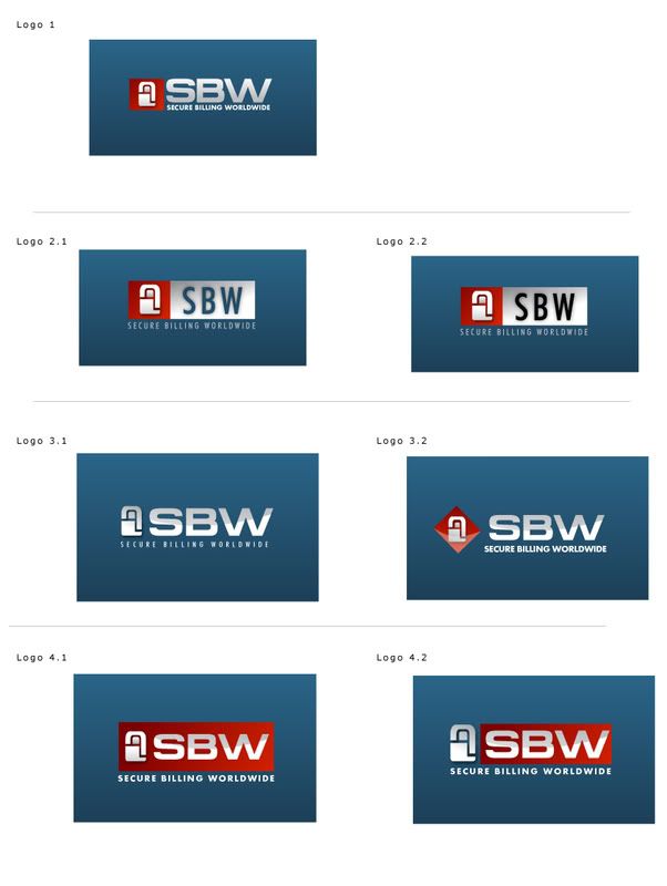
With that said, the following images represent different variations of Logo 1 that would all integrate well with the current report design.
LogoWorks
The left images are the compositions presented by Logoworks, while the right image is an idea of how they would need to be rendered in order to integrate with our current reporting design.
Logoworks 1
Logoworks 2
Logoworks 3
